Surgev1.3
The source for how Idea Studio looks, reads and behaves.
Power in every action.
This isn’t yesterday’s brand guide. It’s a living, breathing design system. Surge is the operating system that lives across every Idea Studio surface: the principles, the voice, the mark, the colour, the type and the components that follow. Built for the user with restraint and accessibility, it rewards the person using it with a charge of power at every action.
Grab the surge and pull.
The standards behind every decision.
When a choice is unclear, these break the tie.
Design for lasting value, not current trends.
Build reusable components, not one-off solutions.
Alignment, proportion and rhythm establish visual order.
Remove anything that doesn't improve understanding.
Every element has a defined function.
Change only when the result is better.
Intelligent, natural, concise.
We write clearly and directly. Every sentence informs, not persuades. If a line sounds like marketing or a machine, rewrite it.
We use
- Plain, confident sentences.
- Specifics before adjectives.
- Canadian spelling: colour, behaviour, centre.
- Dry humour, sparingly.
We avoid
- Marketing language and superlatives.
- Clichés and filler.
- AI tells: delve, tapestry, "it's not just X, it's Y".
- Exclamation marks and emoji.
Think. Make. Repeat.
The studio's working mantra, set as a repeating typographic field. It carries the voice into the surface itself, a quiet texture behind the work rather than a line printed on top of it. Used as a low-contrast background wash on immersive sections, it sits behind content and never competes with it.
think-make-repeatUse: background wash on immersive sections, low contrast.A symbol of energy and identity.
The mark is a lightning bolt. Look closer: the dot forms an i and the stroke reads as an s, the initials of Idea Studio.
Downloads
Vector SVG, single colour. Use the reverse set on dark, the standard on light. Keep clear space around the signature equal to the height of the bolt; never recolour, stretch or rebuild it.






Deep navy, one electric cyan.
The system runs on near-black navy, one high-energy cyan and a set of slate greys for text. Green and orange serve as limited secondary accents. Every colour is a token that flips between dark and light. Hover a band to open it, then click a value to copy.
Secondary, limited use
Two accents for specific jobs only. Green marks success and simple data; orange marks attention and warnings. They never carry a page, never replace cyan, and appear sparingly.
When to use cyan
The single brand accent: hover and selected states, focus rings and inline links. Hover carries a soft glow; a selected state holds the same cyan without it. Buttons rest in slate and rise to cyan only when hovered or selected. If two things are cyan at once, one is probably wrong.
Navy is the surface; the slate steps carry all text and hairlines. This is 90% of any screen, quiet on purpose.
Cyan is the only colour with meaning. Reserve it for the single most important action in a view. Everything else is navy and slate; green and orange stay secondary.
Alternate light mode
A grey-blue surface set for immersive areas that want depth without going dark, the Surge game first. The page takes the Think. Make. Repeat. watermark grey-blue; surfaces lift lighter so a board reads as a lit playfield and the surge keeps its pop. Applied per area, never as the site-wide light theme.
Two typefaces for the brand. One for the data.
Berthold City, condensed italic uppercase, is the display voice, used only at the largest, most deliberate moments. General Sans carries everything you read, building the whole hierarchy from its own weights. A system monospace (SF Mono, Menlo) sets mechanical values: hex codes, specs and code. This guide practises the restraint: every heading here is General Sans.
By design.
--font-displayUse: hero & case titles, the wordmark. Little else.Hierarchy, built in General Sans
General Sans gives the full range, Regular through Bold with real Medium and Semibold, plus true italics. Size, tracking, colour and case do the rest, and the nav and UI labels sit on a 500. No synthetic weights.
The monospace is the platform's own stack, not a shipped webfont: the right, lightweight choice for values a machine cares about.
How the UI behaves.
The interface language you'll actually reach for. Everything here is the site's own CSS, so a specimen is the real component, not a picture of one.
Buttons
One button, used everywhere. A panel: the footer surface, a hairline border, an uppercase label, 40px tall, 6px radius, semibold. The surface is what lets it read as an object rather than a hairline floating on the page; where the button already sits on that surface it blends and the border holds the shape, so nothing needs a special case. It never fills with the accent. Point at it and the border and text rise to cyan under a soft glow; the glow is the hover signal. A selected or current control holds the same cyan but stays steady, without the glow, so where you're pointing and what is chosen never read alike. There is no primary and secondary, only this button and a quieter inline link.
Button, or link? Controls are buttons; prose gets links. Anything you click to navigate or act, the top nav, filters, downloads, outbound links and the call to action, is the outline button. A plain text link is reserved for a reference inside running text, where a boxed button would break the line.
--line border, --slate textHover: --cyan + --glow haloSelected: --cyan, steady, no glowFocus: 2px cyan ringThe hero line
One cyan line carries the charge everywhere it appears: the game frame, the Score and Level windows, the trail you draw, and every progress track, the possibilities slider, the testimonial scrub and the article listen bar below. All of them share one weight and one glow, so the language reads as a single system rather than four look-alikes. A crisp cyan core at the frame weight, a translucent band the width of the line to each side, then a soft bloom, closed by the surge tip: a hot core, a cyan body, a layered halo. The core stays cyan in both modes; light steps the glow down in intensity, never in hue, so it reads on a light surface without washing out. Weight and glow are single tokens, so the whole system moves from one place.
--cyan at --frame-wBand: --glow-o (0.50 dark / 0.34 light)Bloom: --bloom-oTip: --surge-grad / --surge-glowThe Surge effect
Surge’s most visible expression, and the one motion a button makes. Press it and a spark of light is born on the outline, swells as it rides the top edge along the cyan highlight, then draws back down and fades. Deliberately restrained, and reduced-motion removes it entirely. Everything stays fully usable and legible with motion off and by keyboard. Original to Idea Studio, 2026.
reduced-motionVariants
The button never changes shape; an icon names the action. A download pulls down. A link that leaves the site points up and away. Nothing else is added.
Interactivity & motion
Every motion in Surge is capable of dynamic motion and interactivity. To show the control can be pushed further, we made a simple game.
Grab the blue surge and draw a closed shape. Avoid the red. Trap it inside your shape for bonus points.
Iconography
One weight for every icon: monoline, 2px stroke, round caps, on a 24 grid, shown at the size they're used. Motion is purposeful: an icon moves only to show what it does. Hover any tile to see it.
Status labels
A small squarish stamp for state that would otherwise read as stale: availability, a freshly shipped page, a live feature. Body type, 11px, uppercase, 5px radius, with a tinted fill and hairline border in the state's colour. It sits at the end of a line, never on its own. Green marks a positive, current state; cyan marks something new. Any date is set in script so the notice never ages.
--green tintNew: --cyan tint5px radius · 11px · uppercaseInputs & states
rgba(51,194,255,.18)Cards
Life below the surface
A reef bringing a coastline back to life.
reduced-motion fallback.--navy-panelImages
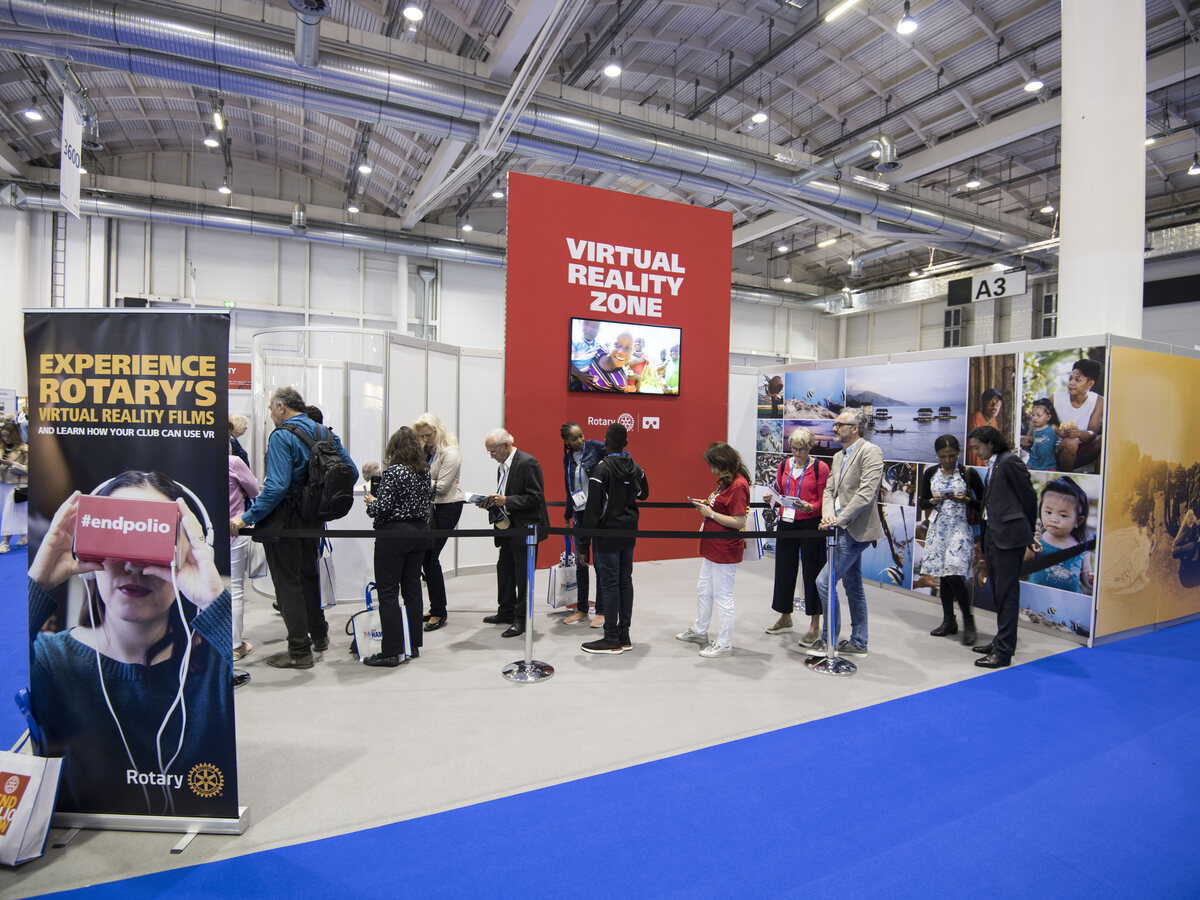
One frame for every image. A .frame is a fixed window that clips its picture, so on hover the image pushes in: it grows and is cropped by the frame, never resizing the layout. Whole image: <figure class="frame">. Cropped to a ratio, for grids and cards: <figure class="frame crop" style="--ar:3/2">. Tune with --ar (ratio) and --r (radius); add bare to drop the hairline. A gallery is a plain grid of frames. Cards, galleries and team photos all share this push-in-through-the-window hover.
reduced-motion..frame crop · --ar sets the ratio, --r the radiusFilm & audio
Media never autoplays with sound. Video shows a poster with one circular play control that fills cyan on hover. The audio player uses the Surge bar for its scrubber, the same hairline-and-glow progress track that drives the testimonial nav: a line at button-outline weight, a cyan glowing fill to the current point, no handle. Grab it to scrub.
Loaders & lightbox
The page loader is the bolt itself: cyan charges through the mark, then it flies at the viewer once the page and every 3D model are ready. Substantial images open into a near-opaque lightbox at up to 94vw / 84vh, which is why we source them at full resolution.
Working with the system.
This system is generated from the live site, so what you see here is what ships. A few things to keep us in step:
Start from the parts. Reach for the colours, type and components defined here before inventing new ones. If you need something that isn't here, that's a conversation, not a guess. It probably belongs in the system.
Reserve cyan. One action accent per view. Lean on navy and the slates for everything else, and keep green and orange to their limited secondary roles.
Ask for anything missing. Source files, an extra logo lockup, a colour value, a component spec: we'll get it to you.
Say helloSurge Design System · Generated from ideastudio.ca