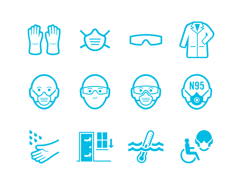
Signage designed to be recognized, not read.
In healthcare, every second matters.
Healthcare workers often move quickly between patients, departments and responsibilities. Existing infection control signage had become easy to overlook, making it difficult to recognize the level of risk and follow the correct precautions before entering a patient's room. The goal wasn't simply to communicate information. It was to communicate it instantly.
Good information design isn't read. It's recognized.
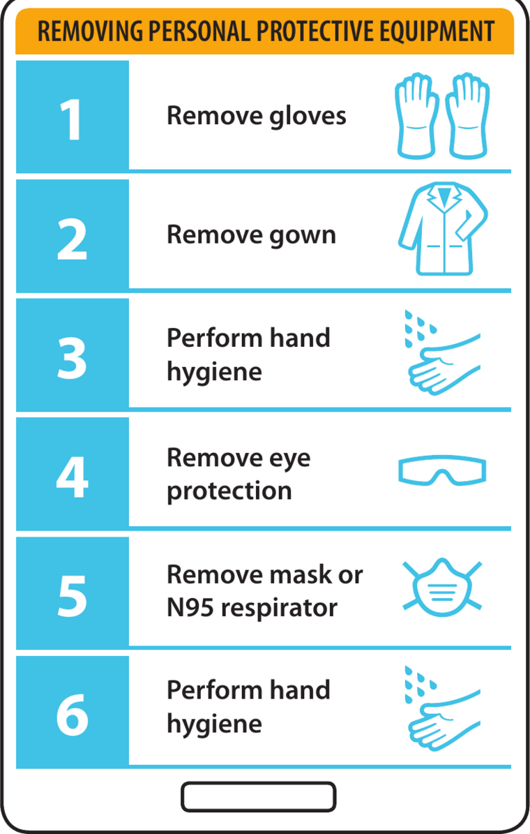
Idea Studio developed a standardized visual language that helped healthcare workers identify transmission risks at a glance. Through consistent iconography, colour coding, typography and layout, complex infection control procedures became easier to recognize, understand and remember across hospitals and long-term care facilities.
Rather than relying on dense instructional posters, the system was designed to support fast decision making during the moments when it mattered most.
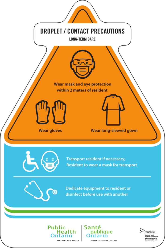
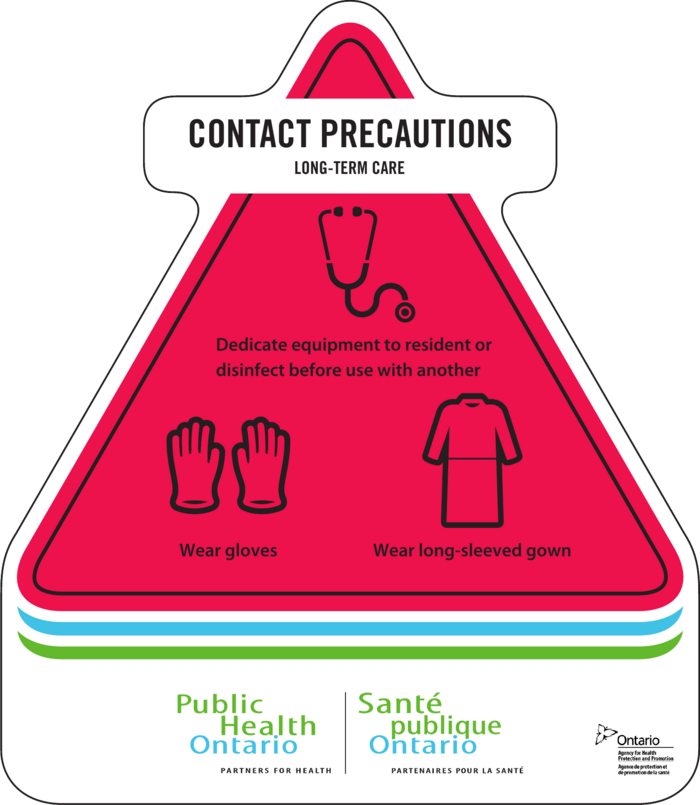
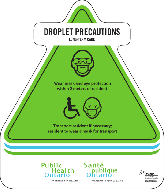
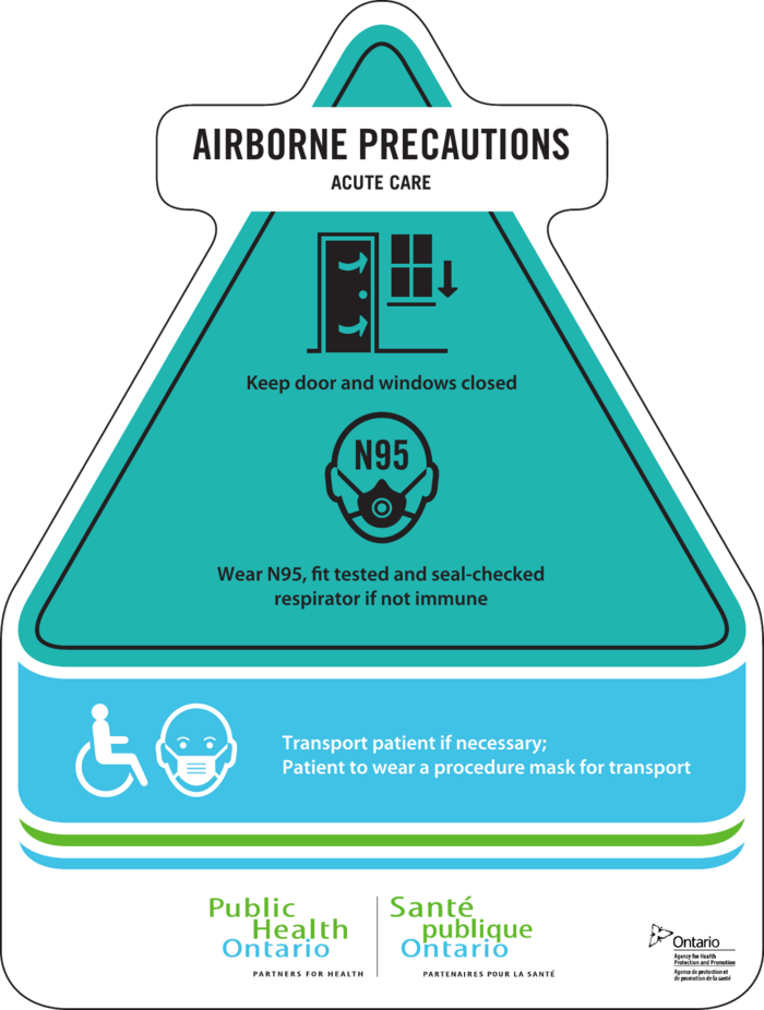
The project extended beyond door signage.
The same visual system was applied to lanyards, procedural reference cards and supporting materials, creating a consistent experience across multiple touchpoints. Whether entering a patient's room or reviewing protective equipment procedures, healthcare workers encountered the same visual cues, reinforcing recognition through repetition.
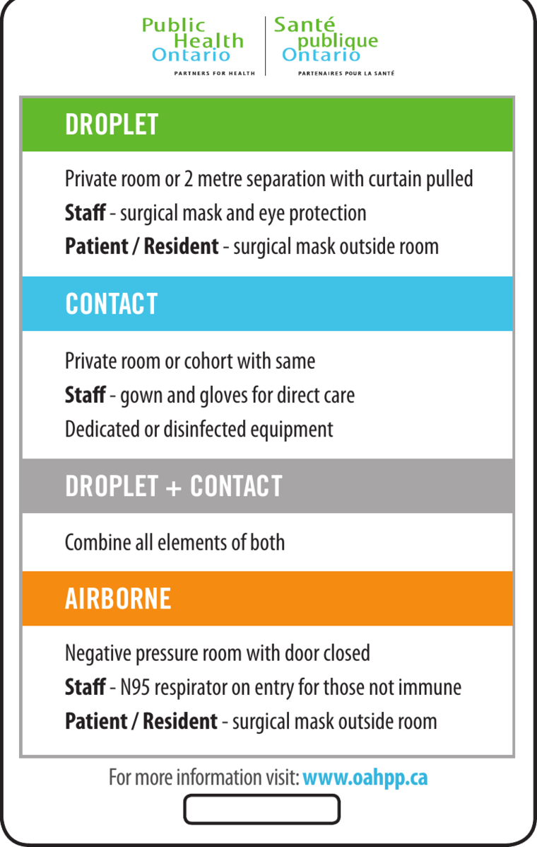
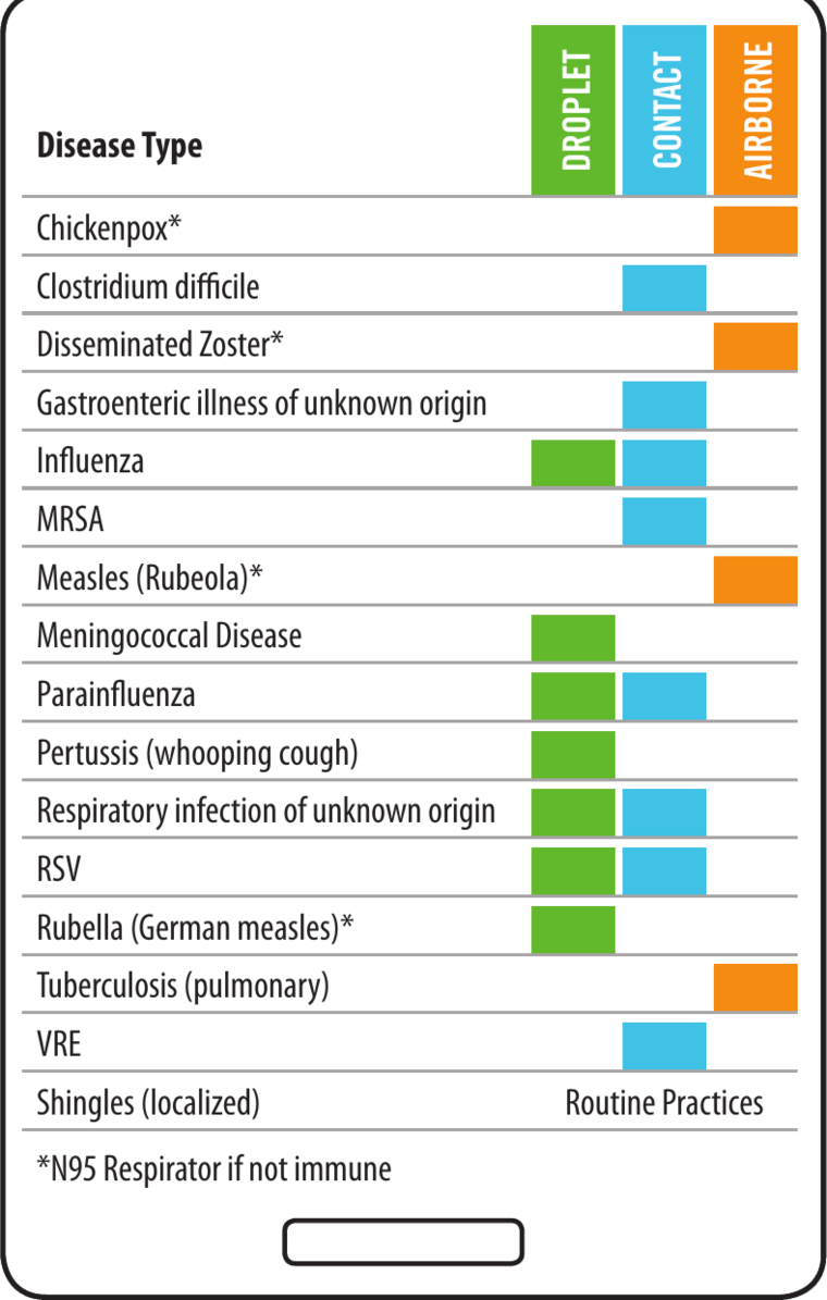
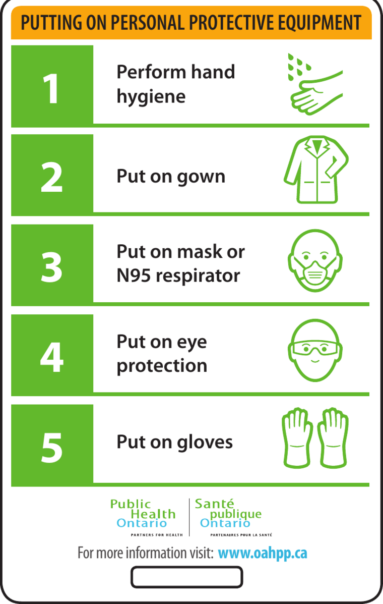
The objective wasn't simply to improve signage.
It was to create a visual language that healthcare workers could recognize almost without thinking. By reducing cognitive effort and increasing clarity, the system helped support safer decisions in environments where attention is constantly divided and every moment counts.
Iconography designed by Jason Munger.